Pimp My BAS
People like shinny new things. Your BAS can be controlling to tolerances tighter then the atomic clock but if it doesn't have a "nice" User Interface your customer will wonder what exactly are they paying you for.
I have to comment before the naysayers interject and say "Look Phil, I care more about functionality then visualization".
Look, I'm sure you do care about functionality but I'm sorry my friend you are the exception to the rule. The average user at the Local elementary school or commercial office building wants an intuitive user interface (UI) with pretty pictures (or in the case of the hotel I am staying at right now the user simply wants a time clock but that is another story...)
Now, don't get me wrong I'm not saying your BAS front-end needs to be a photo-realistic experience the likes of the movie Avatar. I am saying that most BAS front-end's are not user-friendly and their graphics experience lies somewhere between the artistic level of my 5 and 7 year old's.
Now what follows goes against every operational management and P&L sensitive bone in my body. You must spend time (labor) on your UI's. The cookie cutter drag and drop graphics and layouts will not cut it. I've been to too many darn sites that have 30 thousand unacknowledged alarms and when I ask them to show me the system the user can't figure it out because it looks like some mensa puzzle in the back of a magazine.
Over time I have come up with three steps that will help even the novice develop a top-tier BAS UI.
The Steps!
It really comes down to three easy steps.
Step 1: Consult your Users
Step 2: Design a Template
Step 3: Implement and Measure
Step 1: Consult Your Users
Ask a subjective question and you will get a subjective answer. What do you like about your interface? What do you think about your graphics? How could we make your User Interface better? All of these are subjective questions and they make it difficult for you to triangulate on a specific need.
Instead of asking subjective questions ask questions that develop the theme, the flow, the process (whatever you want to call it). Take "What do you think of your graphics?" and replace it with "Show me how you access your graphics?", "What do you do when you first logon?", "How do you get to a unit, how do you diagnose a problem with your front-end".
Push back!, look I realize in your CMS that AHU 101 is called 107FCEX2 but wouldn't it be slightly.... easier on your guys if they could go to Northwest 4th Floor AHU? We are talking about creating a usable interface not a NASA diagnostics panel! To that point, agree what the ontology should be, will we call all zone temperature sensors ZN-T or RM-T? Simple? Maybe, but, I cannot begin to count the number of sites I have visited where you can't use your BAS's search function because every point uses a different name.
Key Takeaways
- Understand how your user navigates their system.
- Where are the key areas of use for your client?
- Implement and Measure
Step 2: Design a Template
A BAS user should be able to get to any system with less than 4 clicks of their mouse. What does this mean? If I opened a VAV box graphic. You should be able to tell me navigate to North Building 4th floor, Room 101 Vav Box and I, knowing nothing about your system, should be able to do this.
So how? How do we make a system easy and intuitive? It begins with a template, I will share the template I have used for the past several years, it is not the only way of creating a UI but it is my way. If it works for you great, if not throw it away.
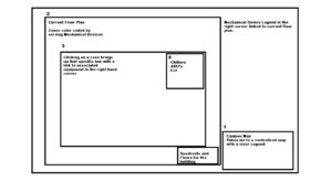
- You begin with a campus map in the lower right hand corner. Clicking on this will bring up a campus map or campus building list with a legend.
- Clicking on any building will bring up the main floor plan with zones color coded by the equipment that serves them. In the upper right hand corner will be a quick link to mechanical equipment and in the lower right will be a quadrant map of the Floor and a link to other floors.
- Clicking on a specific zone will show that piece of equipment
- A list of the equipment serving that piece of equipment will be in the upper right hand corner.
Notice that each layer will lay upon the other. The layers become intuitive allowing a client to be trained to follow a four step process no matter where they are on the UI to access any system. Imagine the satisfaction if your client could simply say "Find South building 4th floor room 10" and then could instantly navigate to the systems serving that equipment.
Points and stuff
Zn-T, RM-T, Space-T, T? Which one do you use? Honestly it doesn't matter, just use the SAME ONE!. You give your client a powerful BAS that can sort by tags, metanames, objects, ect and then you give them 1000 different names?? How is this helpful? How is this easy? Is the zone temp bad for room 101 or is it the room temp or is it the space temp? HELP!
But Phil, we have had 10 different installers and they each used their own naming. Well SHAME ON YOU!
Would you let someone build you a car with a green hood, red door, and brown trunk? Would you let someone use different color bricks on each side of your house? So why in the world would you think it's ok to do the same crap at your clients sites?
Key Takeaways
- Use a process driven, interconnected, easy to understand graphics layout.
- Select a standard for the layout and help the client get it written into the spec.
- Work with your customer to correct past mistakes and get their system streamlined (this will pay dividends in the future).
Step 3: Implement and Measure
So you've followed the steps, you've figured out how your customers use their system and you have a plan right? If not rinse and repeat steps 1 and 2. Seriously though, this isn't rocket science if you sit with 2-3 customers you can pretty much figure out what you need to do. I would be willing to bet that you already know what you could be doing better.
Here's the reality of the situation. Most campuses have not had the privilege of a standardized user interface so you have some work to do. Now you can flounder about and let the problem get worse or you can have a meeting with your customer and tell them your strategy to begin to standardize their user interface over the next few projects. I'm pretty sure your customer will like the idea but hey even if they don't it's your fault they are in this mess in the first place....
Now its up to you to implement this plan, target existing customers first. I know this seems like it would be counter-intuitive as correcting old mistakes will take more labor. This actually is by design. First you need to solidify your base, install your new UI format, make this your signature and charge accordingly. Once this concept is proven then start deploying it to the market place.
Measure the receptiveness, are your clients noticing a greater ability to respond to issues? Is their productivity increasing? If so this might be a great time for a case study? Hey, I'm just saying if you're doing something good there's no shame in bragging about it...
Key Takeaways:
- Don't drag on pick 2-3 existing customers and run through the process.
- Refine the process taking notes of what is working and not working... Look at it from multiple stakeholder perspectives (the tech, the mechanic, the facility director.
- Implement your proven design, adjust as new technology comes out, and brag shamelessly about your success (who know's you might change the market place).
Conclusion
So, to recap.
- Get feedback from your customers on how they use their systems.
- Create a template for the user interface and the naming scheme (think 4 clicks to get to any system).
- Meet with the customer and implement these changes and then measure the results.
- Seek feedback make adjustments and watch as your installations stand-out from all the wannabes.
What has your experience been with a BAS user interface?
What expectations do your customers have for their UI?
Are you seeing these standards being put into specifications? Should they?
This article seems so basic but if it's so basic WHY ARE SO FEW PEOPLE DOING IT?
Drop some comments below and let me know your thoughts.


